Brandbook
01. Logo
Primary P

Icon · 48 px
Favicon · 16 px
Use the same P across Pulse, Finance and Pump. Keep one quarter of the mark’s height clear on each side. Scale proportionally.
Spline construction and downloads
Construction
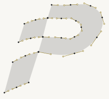
Cubic Bézier curves share tangent and curvature at their joins. Straight cuts define the flag sections.
02. Colors
Canvas#F8F7F3 / #101114Page background
Surface#FFFFFF / #1D1F23Panels and controls
Ink#191B20 / #F4F4F2Text and icons
Primary action#FFD84APrimary buttons and active navigation
Graphic accent#E7B900Decorative accents
Text accent#806500 / #FFD84AAccessible accent text
Heading accent#EFAA11 / #FFD84ALarge heading text
Paired values: light / dark. Primary buttons use dark text. Status feedback must include a text label.
03. Fonts
Headings and body
Arial
Arial, Helvetica, sans-serif. Regular body text; bold product headings and primary actions.
Metadata
Monospace
ui-monospace, monospace. Labels, coordinates and technical values.
| Role | Specification | Sample |
|---|---|---|
| Wordmark | 14–20 px · 700 · uppercase Shared responsive tracking and logo spacing | PULSE |
| Product heading | 34–54 px · 700 · 1.02 line height | Swap |
| Product section | 22 px · 500 | Your portfolio |
| Body | 16 px · 400 · 1.6 line height | ABCDEFGHIJKLMNOPQRSTUVWXYZ abcdefghijklmnopqrstuvwxyz 0123456789 |
| Field label | 13 px · 400 | Amount |
| Metadata | 11 px · monospace · uppercase | Token ID |
04. Graphics
| Corners | 2 px radius on buttons, fields and panels. |
|---|---|
| Lines | 1 px borders and dividers. Product headers use a full-width bottom border with no side borders. |
| Icons | 24 px control icons. Use the primary P only for brand marks. |
| Images | Preserve aspect ratios. The decorative wave background spans the viewport behind the swap form. |
| Motion | Static artwork. Theme changes and tab selection do not require animation. |
| Content width | 1440 px maximum inner width. Header contents and horizontal card rows share centered edges. Side gutters: 32 px; 24 px at widths up to 1050 px; 16 px at widths up to 560 px. Header borders remain full width. |
| Spacing | Use 8, 12, 16, 24 and 32 px gaps. Keep form labels close to their fields. |
| Buttons and panels | Yellow primary actions; outlined secondary actions. Form panels use a soft shadow, a shallow surface gradient and a fine upper-left border highlight. Light: warm metallic edge (#AFA58D → #D0C4A2) with a white inset highlight. Dark: brighter edge (#92928B → #665F43). Fields use a subtle inset shadow. Controls have at least 44 px touch targets and visible keyboard focus. |
| Token selectors | Custom dropdowns show a 28 px token logo to the left of each ticker, in both the selected control and its options. Balance sits above the control, aligned right. Support keyboard navigation, Escape and outside dismissal. |
| Amounts | USD equivalent directly below each amount. Initial value: $0.00 USD. Numeric entry has no visible stepper buttons. |